This is the final version of our music video:
Friday 15 December 2017
Thursday 14 December 2017
Colour juxtaposition: success?
These are the screenshots from our music video, with the final version of colour grading. These show that we were successful in terms of creating a juxtaposition between white and red colours, which connote the contrast between loneliness and passion:


Music video: rough cut.
This is a link to Anastasiia's blog, where she has posted the rough cut of our music video:

Tuesday 12 December 2017
Monday 11 December 2017


Sunday 10 December 2017
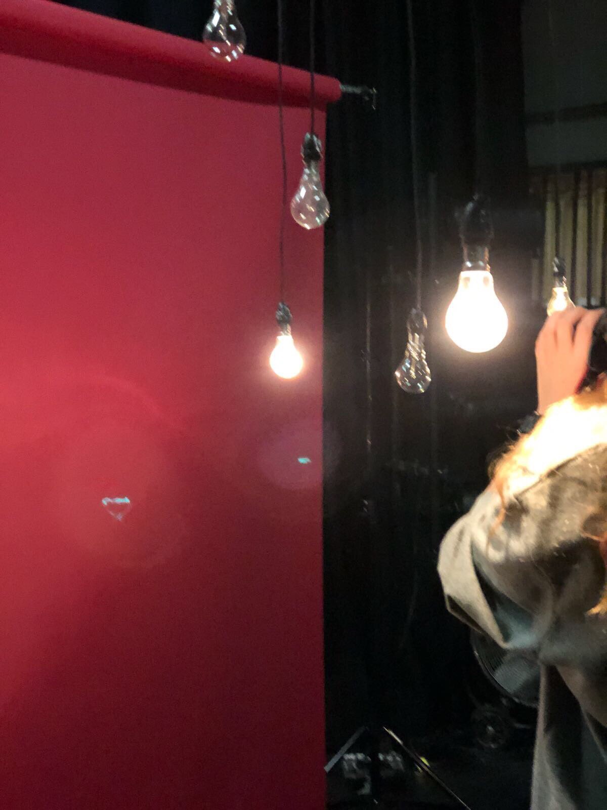
Cheri's look for the music video.
So this is how our star Cheri looked on the shooting day, this is the image we have constructed for her: red lips, make-up to highlight her pretty eyes and lips, red dress and high heels to show off her body. Overall, she looks like a glamorous, synthetic star, which attracts attention of the audience.


New photoshoot for the digipack.
After the focus group we have received some good feedback on how to improve our digipack. We were told to think about something more entertaining for our star to do on the front cover, as well as think about the different back cover and the CD, because the lips on the red background look too creepy.
As a result, we have decided to carry out another photoshoot, where we came up with new, more interesting ideas. For the front cover we asked Cheri to bite a cherry, because it's a direct link to her nickname and for the background we have decided to take a 'behind the scenes' picture, as if her fans are taking pictures of her after the concert, which connotes her popularity and importance.


Wednesday 6 December 2017
Focus group: feedback video.
This is the video from our focus group,
which shows the full feedback we have got:
which shows the full feedback we have got:
Tuesday 5 December 2017
Focus group: the whole campaign feedback.
This is the notes from our Google Drive about the feedback we have received during the focus group:
Overall the feedback on the music video was positive and it is said to be similar to the other videos of the same genre. Here are the main points that were mentioned:
- Red and white as juxtaposition worked very well
- The build-up for the first chorus seemed anti-climax for some of the members of the focus group
- Opinion on the makeup was quite mixed: for some people it was confusing to see her without makeup and then with it, however other thought that it worked well as natural makeup suited the idea of her inside the sheets and glamorous when she is in dresses and in high heels
- When we asked if they would want to see more of the particular element, they said that it would be nice to see more of dancers. Also, some people wanted to see more episodes of the artist with a guy. However, at the same time, they said it worked that we have not seen him and it leaves to the imagination of the viewer to decide who it was.
- The ending on the dancers was unexpected and confusing. This group expected the video to end with the artist herself.
- For the album cover we had positive and negative feedback. Here are the main points:
- Colour theme of white and red works well, however reminds a bit on Christmas
- Album cover has a good representation of the genre: pop
- The front and back looks a little bit cheap due to the blur effect
- The font is readable, however it is not clear what is album name and what is the name of the artist.
- Colour theme works well and connects all products together
These are the diagrams we have put together to some of the reflect the feedback received:
Which product from the music campaign is the best?

Was the make-up on the lead singer good?

Focus group: album cover feedback.
As I was responsible for making an album cover I was also the one to do the focus group for it. I asked all the questions I've prepared and got a lot of feedback, both positive and negative.
These are the key points:
1) The white and red juxtaposition looks great, but slightly reminds the Christmas theme.
2)The artist needs to do more on the album cover - her just looking in the camera is a bit boring.
3) The font is readable
4) The genre is clear - pop/romantic music
5) The album and artist names are not clear

Focus group: digipack preparation.
After the division of labour in our group I became responsible for making a digipack. This also means, that I would have to present the album cover I made in front of the focus group and ask their opinion. These are 9 non-leading questions I have prepared about the Cheri's digipack:
1. What do you think about the digipack?
2. Do you think the four pictures link together?
3. Do you think the colours work?
4. Could you tell the music genre from this digipack?
5. What do you think about the artist and the album names?
6. Is the font readable? Does it link to the style of the album cover?
7. Can you remember any similar album covers of the existing singers or bands ?
8. Would you notice this album on the shelf in the music shop, do you think?
Also, I have printed all four templates of the album cover, as well as the spine, on the A4 paper to hand to the focus group, so that they can have a critical analysis of it.
printed digipack:

(critical analysis)

printed digipack:

(critical analysis)

Focus group: overall preparation.
In order to receive qualitative feedback we have prepared questions on each section; website, digipack and music video, as well as the whole campaign questions:
Website questions:
What do you think of this website?
Which genre do you think this website promotes? Why?
Do you think there are enough pictures of the artist? Or enough pictures in general
How it is compared to other websites of similar genre artists that you have seen?
Best point of the website?
The worst point of the website?
What can be improved? (if anything)
Digipak questions:
What do you think about the digipack?
Do you think the four pictures link together?
Do you think the colours work?
Could you tell the music genre from this digipack?
What do you think of the artist and the album names?
Is the font readable? Does it link to the style of the album cover?
Can you remember any similar album covers of the existing singers or bands?
Would you notice this album on the shelf in the music shop, do you think?
Music video questions:
What elements of the music video worked (if any)?
What elements of the music video didn’t work (if any)?
Were there any elements of the music video you wanted to see more of?
Were there any elements of the music video you wanted to see less of?
What was your least favourite part of the video?
What did you think was the ‘highlight’ of the video, if any?
How did this compare to other music videos of a similar genre that you have seen?
Do you see any juxtaposition in this video?
On the scale of 1 to 10, how would you rate it? (1 being the lowest and 10 being the highest)
Overall questions:
To what extent it is an effective campaign? If at all
Are the genre conventions of pop met, if at all
Do you think there is a link between the album cover and music video?
What are the best elements of the products if at all
What is the worst element of the products if at all
Focus group: what and why?
Focus group is a sample of your target audience, aimed at sharing the feedback about your product. In other words, it's the opinion of your buyer before they buy.

To get honest feedback from the target audience, which would help to adjust and develop your product before starting the mass production. Not to change the product completely, but adjust for better, to make sure the it will be popular on the market.

At this point you have developed something that worth showing and receiving feedback about. In other words, it's not the first draft and there is still time to make changes, which would increase your sales. You haven't yet started the mass production, so any adjustments would not affect you budget and you wouldn't lose money.
Print copies of your album cover and hand it to people. Everyone needs a personal copy, to prevent the mob mentality effect. Plan the questions, so that they are not leading in any way. Record the feedback properly - record a video as well as make brief notes for yourself.
Show the website on the large screen, so that every participant is able to see it. Don't talk about what you are going to do - show what you did. The person presenting the website, should be the one, who actually made it. Record the feedback properly.
Show a music video on a large screen. Bring a USB beforehand or have the correct link prepared in advanced. Write down an appropriate set of questions, so that they are not leading your focus group to a certain answer. Remember, that you cannot change your music video, so don't argue about the major changes or criticisms you focus group puts forward.


The correct order is: digipack, album cover, music video. This is so, because the website represents the artist as a whole, album cover represents the album and music video represents only 1 song. We are going from wide to narrow. We also have to see whether the digipack and the website reflect the music genre, without showing the music video.
Do let one person to lead the focus group. Do have everything ready and prepared. Do interact with the group so that they feel relaxed.
Don't ask leading questions. Don't force the focus group to agree with you. Don't get angry, don't argue back, just record the feedback.
Video recording + brief notes. Position the camera behind the vision of the focus group, so that they don't get confused to talk.
Lastly, try to get as much as you can from the focus group as this is a good way to make your product better!

Monday 4 December 2017
Photoshoping the digipack #3
This is the final version of our digipack, which we will bring to the focus group in order to receive feedback:


Saturday 2 December 2017
Photoshoping the digipack #2
As I've mentioned before, I've made 3 CD pictures to choose from. The first two are relatively similar - continuing with the red and white juxtaposition - but the 'Mon Cheri' is written differently and in the different places. The third one is quite different - Mon Cheri is written on the artist's lips, which remain in her face. I quite like the last one, however, her nose looks a bit odd. I've tried to photoshop the nose and make it disappear, but it looks even odder.


These are the photoshoped finalized templates for the album cover:
FRONT COVER:

BACK COVER:

INSIDE LEFT:

CD:
Friday 1 December 2017
Photoshoping the digipack #1
In our group I was responsible for making an album cover. Before starting I've constructed a rough plan for what I have to do. As you can see from the picture behind, I was looking for what have to be written on the back cover of the digipack as legal info. Also, I drew a couple of sketches and different variations of what pictures to take. This helped me both on the day of the photoshoot and afterwards, during editing. After choosing the 4 pictures for the cover, I started editing. I've used Adobe Photoshop.

The most work I've done with the CD, which was aimed at having the picture of lips and 'Mon Cheri' written on it. Using the clone stamp I've slightly adjusted the shape of the Tia's lips. Also, using the sharpness tool I made it look shiny.
Before: After:


Afterwards, I've started choosing the font for the 'Mon Cheri' writing. I couldn't decide one way to do the CD, so I've made a couple of variations to choose from.
'Mon Cheri' on the artist's lips: 'Mon Cheri' on the rest of the CD:


Editing the hands was easier. I only had to smoother the surfaces and the edges and use a brush to hide Tia's undone manicure.
Extending the manicure with a clone stamp:

Bluring the surfaces:

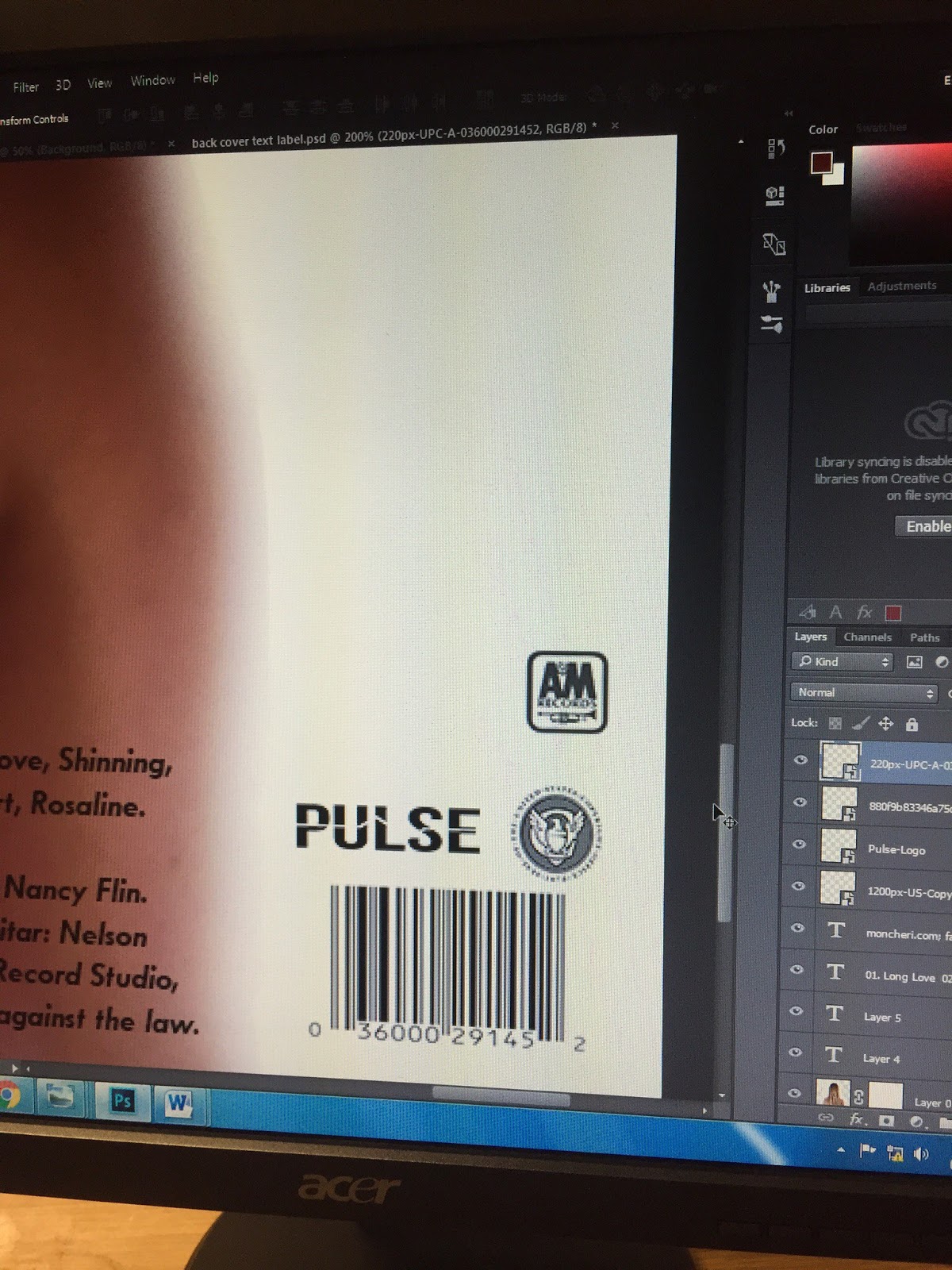
Lastly, I had to add legal info on the back cover, add a bar code and record labels:
Subscribe to:
Posts (Atom)